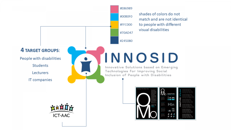
The full name of INNOSID project is Innovative Solutions based on Emerging Technologies for Improving Social Inclusion of People with Disabilities. It can be deducted from the title that one target group are people with disabilities. Beside them, project target groups are also students (from high schools and higher education institutions (HEI)), lecturers from participating HEIs, and IT companies. All four project target groups are shown on the logo with four shapes that resemble abstract representation of people holding their hands. The order of persons forms a cohesive unit that presents teamwork in which all actors contribute equally to achieve the goal of the INNOSID project, ie. to improve social inclusion of people with disabilities by creating innovative IT solutions based on emerging technologies.
The INNOSID project builds upon ten years long activities of the “ICT-AAC Competence Network“ (http://www.ict-aac.hr/) witch goal is to design and develop innovative solutions based on information and communication technologies for people with disabilities. Consequently, in the middle of the visuale identity of logo is the character from ICT-AAC logo. Additionally, the shape of the character itself resembles stylized letter “i“ which at the same time present first letter in the project name.
A palette of five colors is carefully selected so it can be visible to people with different visual disabilities (daltonism, protanopy, tritanopy, etc.). By visible it means that the shades of colors do not match and are not identical. Additionally, the Omotype (https://omotype.com/) letter was selected as text font because it is designed and developed for people with dyslexia and other reading difficulties.
The logo, with its simplicity and at the same time interesting background story, complete the whole vision of the INNOSID project by giving it a unique visual identity.


Recent Comments